New Tool: Compare Energy & Emissions Data Across Northeast States

Here at Synapse, we spend a lot of time looking at energy data, talking about energy data, and thinking about energy data. If you’re reading this blog, you can probably relate to this urge to explore and connect energy data sets. Throughout our work, we rely upon sources that vary based on the question at hand. If we are searching for how Maine tracks progress towards a Maine-specific goal, we might seek out data sources from, well, Maine. Comparing data across states can pose a challenge because there are usually state-specific nuances with how the data is defined, collected, and updated.
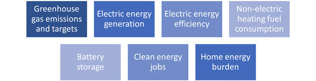
In 2021, we set out to build a dashboard that would allow us to compare and aggregate various energy-related metrics across the Northeast states. The result of this effort is Green Dash, a free and interactive tool based on publicly available data sources. The tool tracks the following metrics:
Note: For the purposes of this tool, the Northeast states include Maine, New Hampshire, Vermont, Massachusetts, Connecticut, Rhode Island, New York, New Jersey, and Pennsylvania.
Access Green Dash and view information on how to use the tool here.
To demonstrate the capabilities of Green Dash, we developed a few questions to explore how Synapse’s home state of Massachusetts stacks up against the rest of the Northeast’s emissions reduction and clean energy transition efforts:
-
How does Massachusetts rank compared to its neighbors with respect to Greenhouse Gas (GHG) emissions? Does the state’s ranking change when looking at GHG per capita?
-
How does Massachusetts’ trajectory of future emissions vary from the rest of the region?
-
How does Massachusetts rank as a renewable energy producer compared to its neighbors?
-
How does Massachusetts rank as a provider of clean energy jobs, and what clean energy industry is best represented as a job provider?
-
How does home energy burden in Massachusetts compare to the rest of the region? Which Massachusetts county is the most energy burdened?
We utilized Green Dash’s state comparison and metric-specific tabs to answer these questions. The following post explores the results displayed within Green Dash.
How does Massachusetts rank as an emitter of GHGs? (1-9, with 1 as the lowest emitter)
#6
The figure below, ordered geographically from north to south, shows that Massachusetts is the sixth lowest emitter of GHGs among the nine Northeast states. The largest contributing sector to GHGs in Massachusetts is the transportation sector.
Figure 1. 2019 GHG emissions by sector
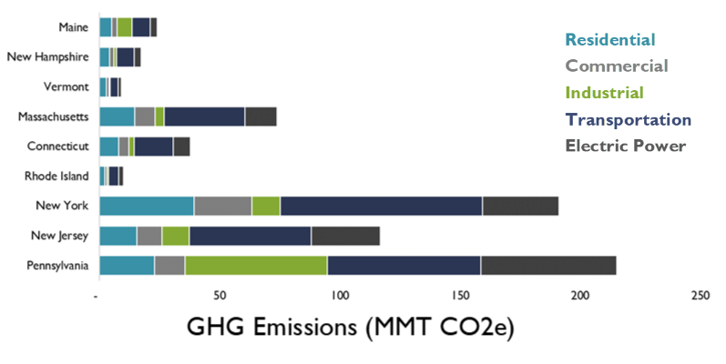
Of course, state population plays a major role in emissions data, with the largest state (Pennsylvania ~ 13M residents) emitting the highest levels of GHGs and the smallest state (Vermont ~ 600K residents) emitting the lowest levels of GHGs. To account for variances in state populations, Green Dash allows the user to normalize data by population, which offers a more accurate picture of each state’s emissions ranking.
Does analyzing GHGs per capita change Massachusetts’ emissions ranking?
Yes, from #6 to #4
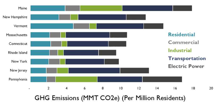
On a per-capita basis, Massachusetts ranks more favorably compared to its neighbors. Maine is the highest per capita emitter of GHGs, while Rhode Island currently holds first place for the lowest emitter of GHGs.
Figure 2. 2019 GHG emissions by sector (per million residents)
Our final question related to emissions is more complex than the first two, as it deals with emissions trajectories over time.
How does Massachusetts’ future trajectory of emissions vary from the rest of the region?
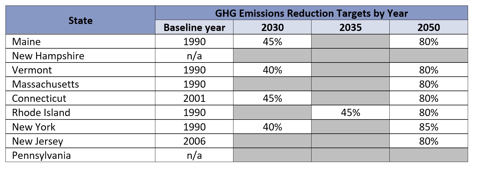
Green Dash reports GHG emissions from 1990 through the most recent data year and then extrapolates to the state-specific emissions reduction targets, displayed below. For states without defined emissions reduction targets (New Hampshire and Pennsylvania), we assume no reduction from the most recent year.
Table 1. GHG emissions reduction targets
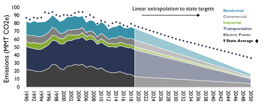
The following chart shows per capita GHG emissions from 1990 through 2050 for Massachusetts, by sector, with future emissions linearly extrapolated from the most recent data year to the state goal of 80 percent reduction in 2050 (with a 1990 baseline). The black diamonds show the total regional average for all sectors combined. The chart below shows that historically, Massachusetts has remained below the regional average for per capita emissions and that the state's planned goal to reduce emissions is more aggressive than the regional average.
Figure 3. Historical GHG Emissions and Extrapolated GHG Emissions Reduction Targets (Per Million Residents) (1990-2050)
View more information on how Green Dash calculates GHG emissions.
How does Massachusetts rank as a renewable energy producer (per capita) compared to its neighbors? (with 1 as the largest producer)
#6
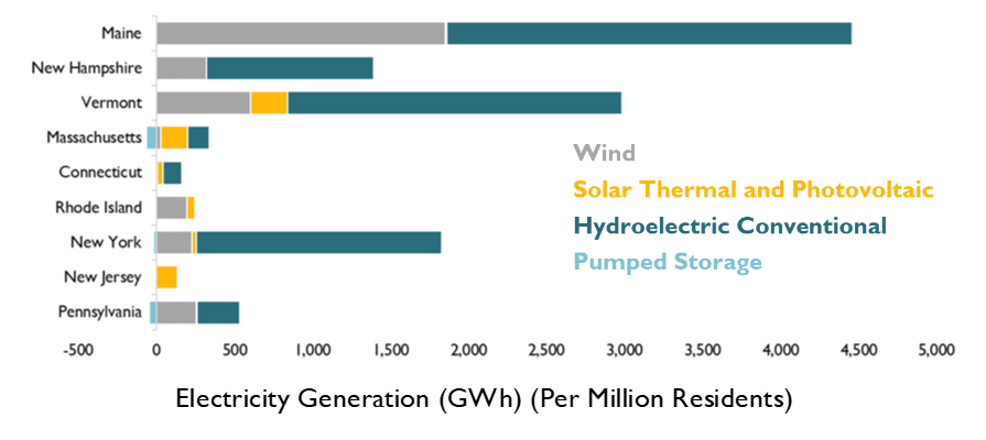
Massachusetts is the sixth largest producer of renewable energy per capita. Reported categories for renewables include wind, solar thermal and photovoltaic, hydroelectric conventional, and pumped storage. Maine, Vermont, New Hampshire, and New York produce the most renewable energy per capita (in that order), particularly due to the presence of hydropower. Meanwhile, New Jersey produces the least amount of renewable energy per capita, all from solar power.
Figure 4. 2019 Annual Renewables Generation by Type
How does Massachusetts rank as a provider of clean energy jobs (per capita), and what clean energy industry is best represented as a job provider?
#2
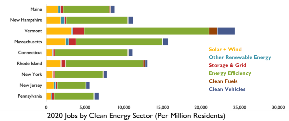
Massachusetts ranks second among the Northeast states for clean energy jobs per capita. Clean energy jobs include solar plus wind, other renewable energy, storage and grid, energy efficiency, clean fuels, and clean vehicles. For Massachusetts (and all of its Northeast neighbors), energy efficiency jobs make up more than half of total clean energy jobs.
Figure 5. 2020 Jobs by Clean Energy Sector (Per Million Residents)
How does the home energy burden in Massachusetts compare to the rest of the region? (with 1 as the least energy burdened)
#3
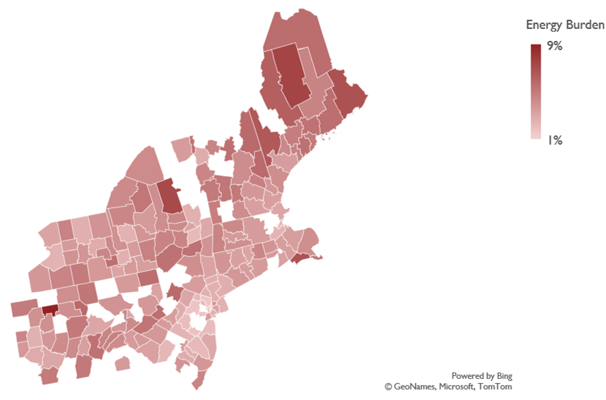
Massachusetts is, on average, the third least energy burdened state in the Northeast. The state's energy burden, defined as the average annual housing energy costs divided by the average annual household income, sits at 2.9 percent (electric, gas, and oil energy costs combined). Green Dash displays home energy burden at the county level, as seen in the figure below. As evidenced by both the table and figure below, Maine has the highest degree of energy burden. Two possible explanations for Maine’s high energy burden are its colder temperatures and the prevalence of oil-heated homes, which are typically more expensive to heat.
Table 2. Average Statewide Home Energy Burden
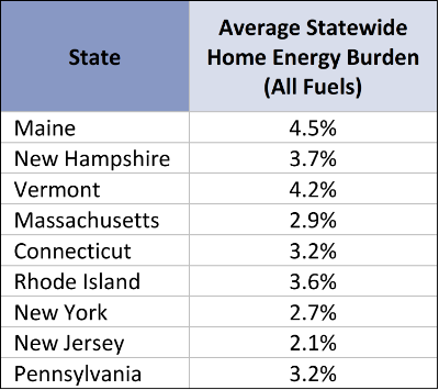
Figure 6. 2018 Residential Home Energy Burden by County
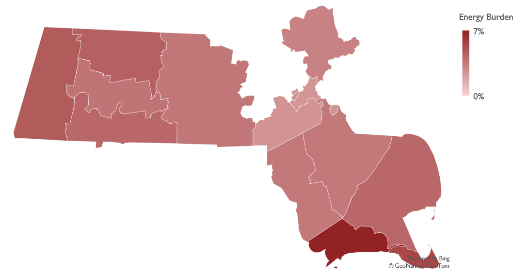
Which Massachusetts county is the most energy burdened?
Green Dash displays county-level energy burden for each state. (Note that Excel’s mapping feature is unable to map various counties in the Northeast, preventing Massachusetts from displaying as its true shape.) In the bottom right corner of the state, Duke County is displayed in dark red as the most energy burdened county, averaging a 6.6 percent home energy burden.
Figure 7. 2018 Residential Home Energy Burden by Massachusetts County
Green Dash explores other metrics than the ones referenced within this post, including metrics related to energy efficiency, non-electric fuels, and battery storage. The tool is easy to use and can help quickly answer your burning energy data questions. Importantly, this tool provides the “what” but not the “why,” thereby maintaining its objectivity, and hopefully luring users into deep data dives—a favorite pastime here at Synapse.
Green Dash was developed by Synapse Energy Economics, Inc. on behalf of the Barr Foundation. This tool is based on publicly available data and can be cited in reports or testimony as:
Synapse Energy Economics. 2022. “Green Dash Northeast.” An energy emissions tool funded by the Barr Foundation. Available at: www.synapse-energy.com/green-dash-northeast.